
I have high hopes that today will be my last day working on the grasscloth wallpaper. I think I have four more pieces to hang in the foyer, two more light switch plates to cover, one doorway trim header to reinstall, a bit of trim to install around the closet doorway, and a few nail holes to repair in all of the door trim headers. And then that project will be crossed off of the list and I can move on.
And it’s just in time because the two fabrics I ordered from Spoonflower arrived yesterday, which means that I can make all of those final decisions (like the final decision on which direction to use the drapery fabric, which I shared about two days ago), and get started on all of the soft furnishings in the room.
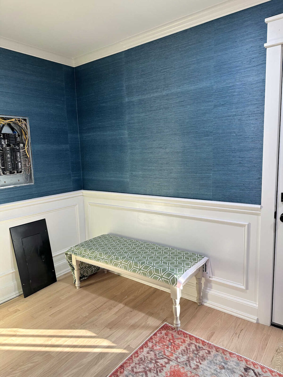
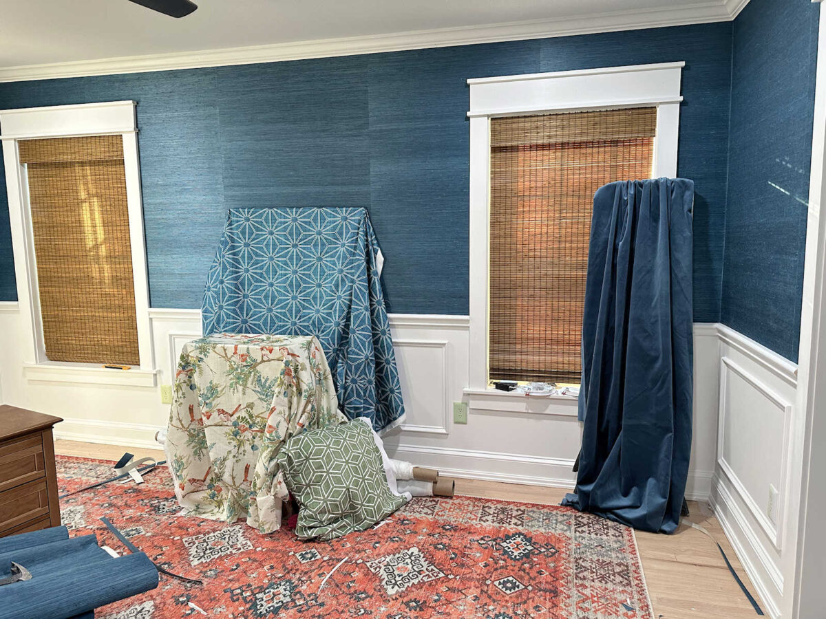
First, here’s the fabric for the foyer bench. I absolutely love the fabric. This is the pattern I chose, and I had it printed on performance velvet.
Spoonflower velvet is kind of interesting. It has a very low pile, so I don’t think it’ll ever have that really luxurious look that most standard velvets have. I could be wrong, but I doubt it. And it almost feels like a cross between a velvet and a felt. It’s different, but I still think it’ll be good against kitty claws, which is why I tend to choose velvet for all of my furniture when I can. Velvet is one of the most durable fabrics when it comes to cats who like to scratch. (Of course, if you don’t keep your cat’s claws trimmed, they can still do damage.)
The green matches the green that I used on the dresser almost perfectly. That was intentional. I chose a paint color that was the closest I could find to the fabric color without having it color matched. The dresser color is Glidden Moss Point Green from Home Depot.
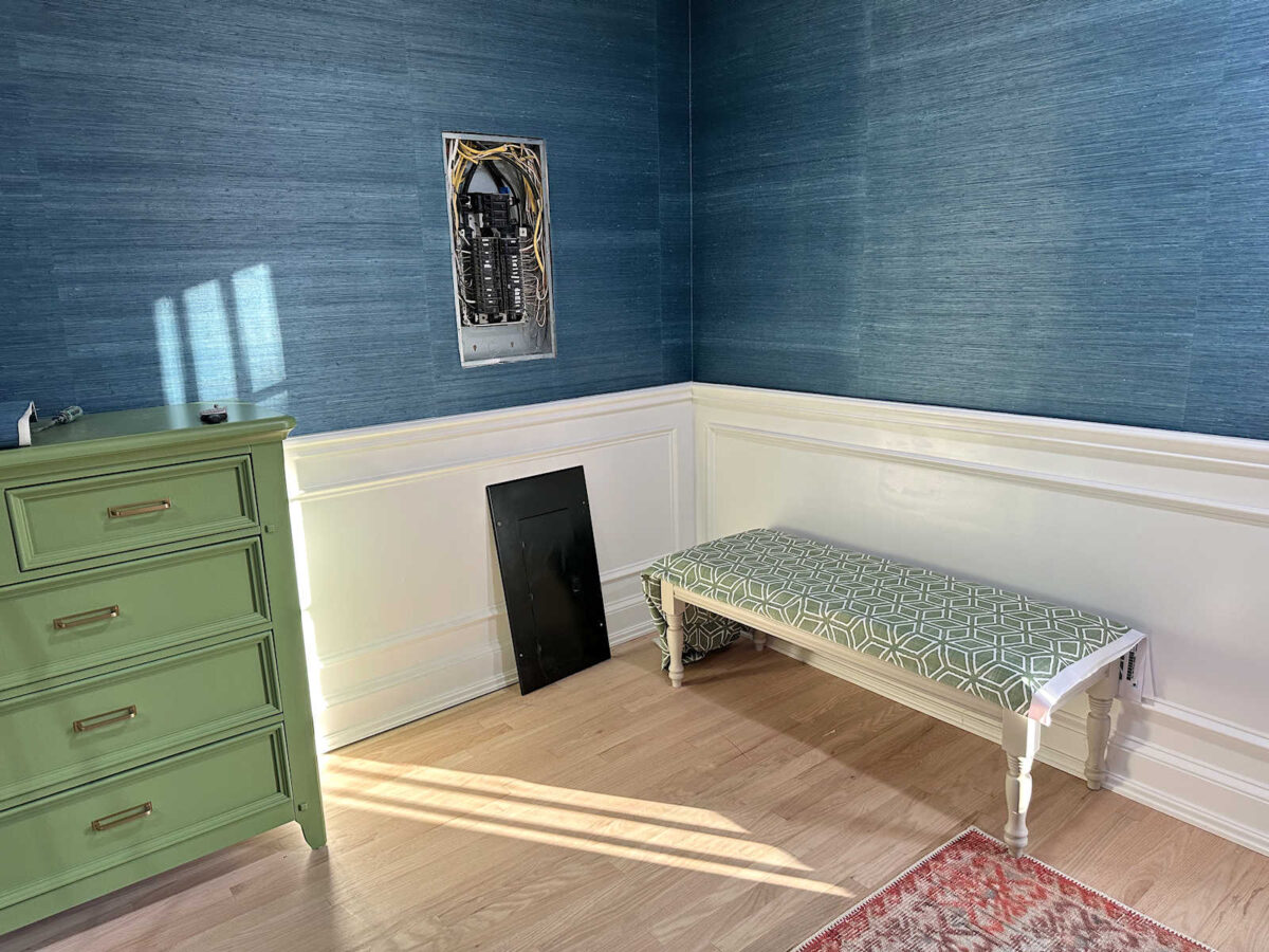
I think I’m going to paint the base of the bench in the same green so that it has more impact. It’s sitting in the corner of the bedroom right now so that I could see what it looks like against the wainscoting and the grasscloth since the corner in the foyer where it’s actually going to live doesn’t have grasscloth just yet. But I think it needs a little extra punch of color with a green base so that it stands out more against the white wainscoting.
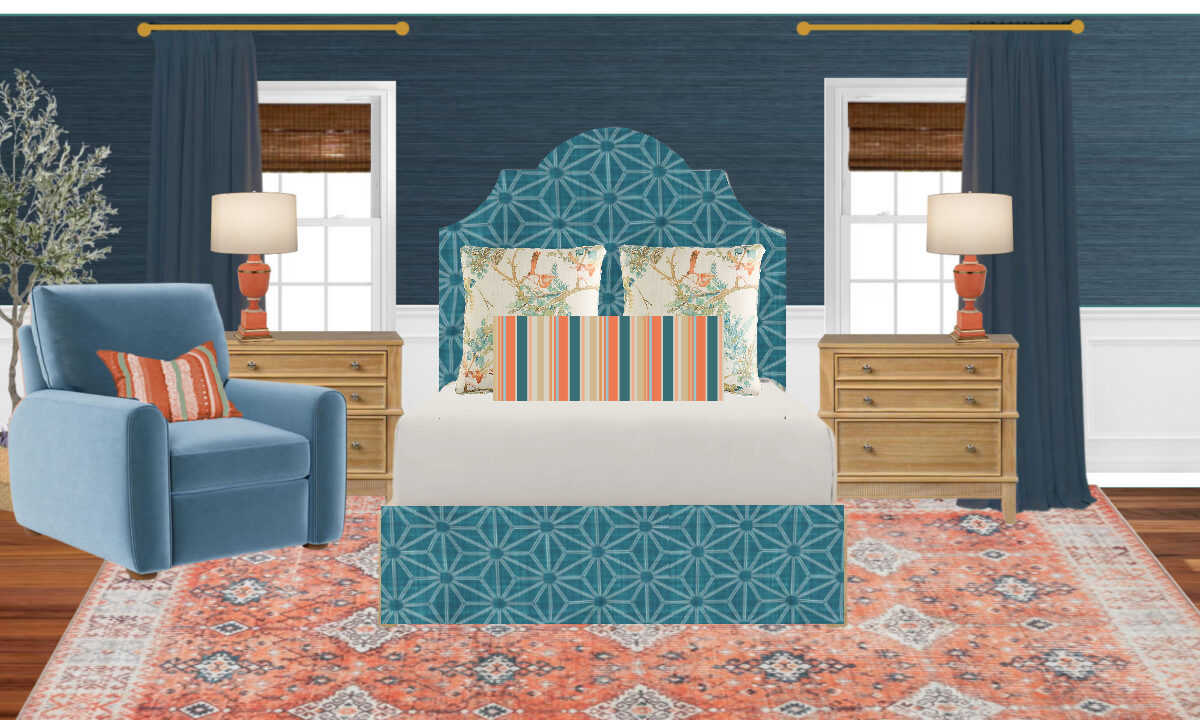
But of course, the most exciting fabric that I received is the one for the headboard and bedskirt. I chose this pattern for those items, and I had it printed on 6.5 ounce wide cotton sateen. The fabric is 116 inches wide, which means that I won’t have to match the pattern or have any seams on the headboard. I was pretty excited to see that they offer extra wide fabrics! And the 6.5-ounce cotton has a very nice weight to it that’s perfect for light upholstery, curtains, pillows, etc. I wouldn’t cover a sofa with it, but it’s perfect for a headboard and bedskirt.
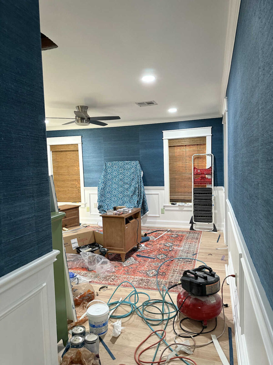
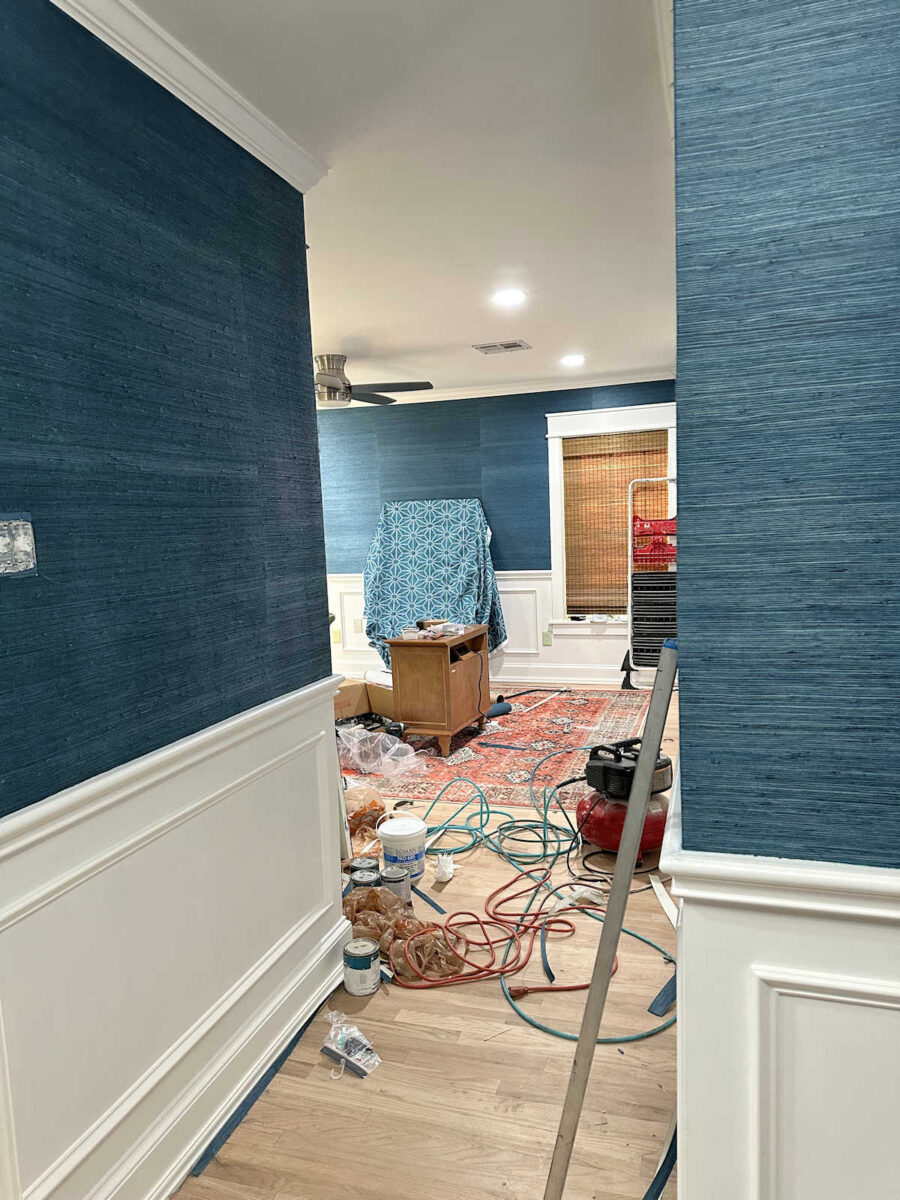
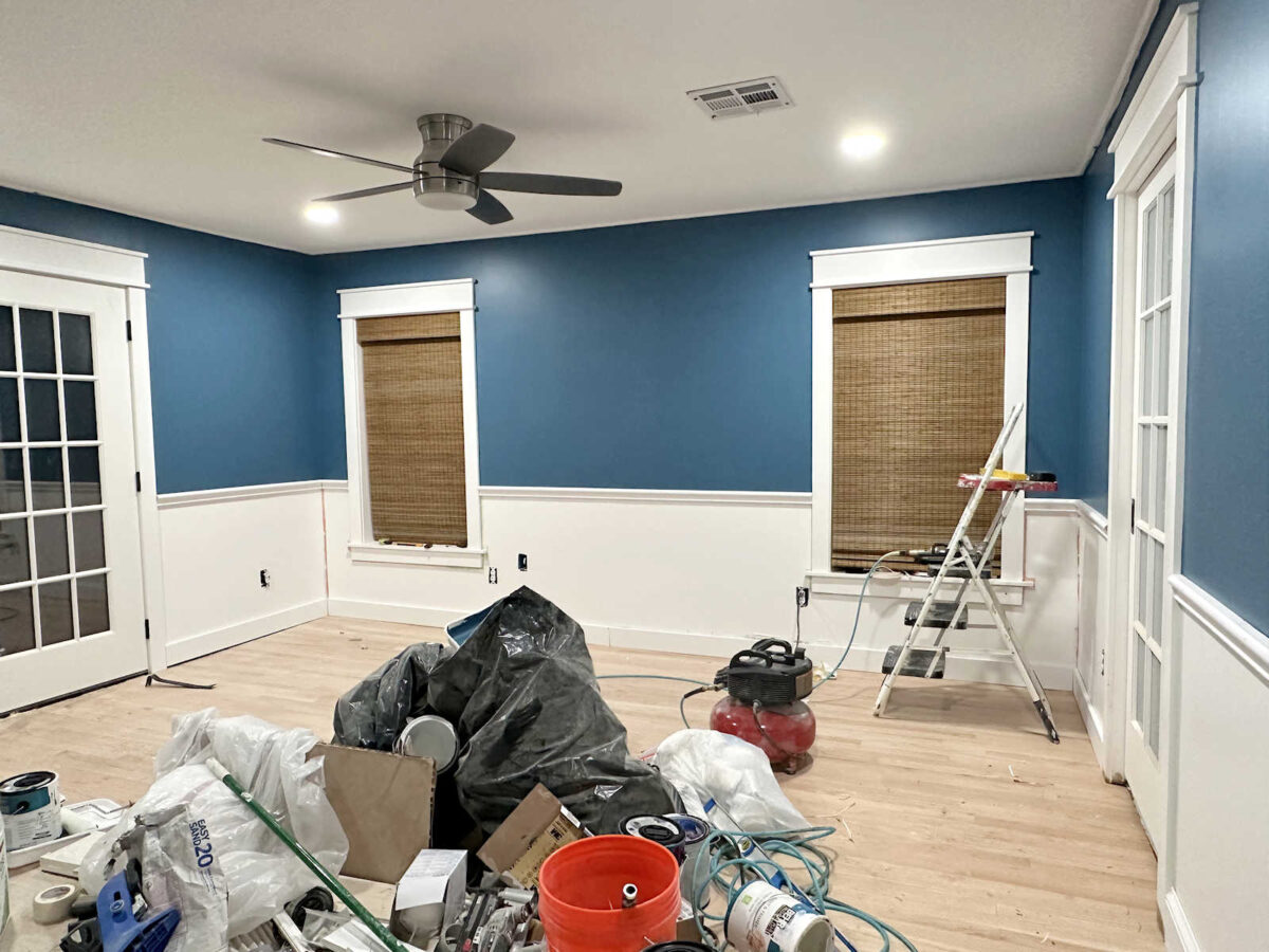
You’ll have to look pass the mess in the room right now. I hope to get all of this cleaned up by the end of the day today. But I just love this view of the fabric against that wall from the foyer.
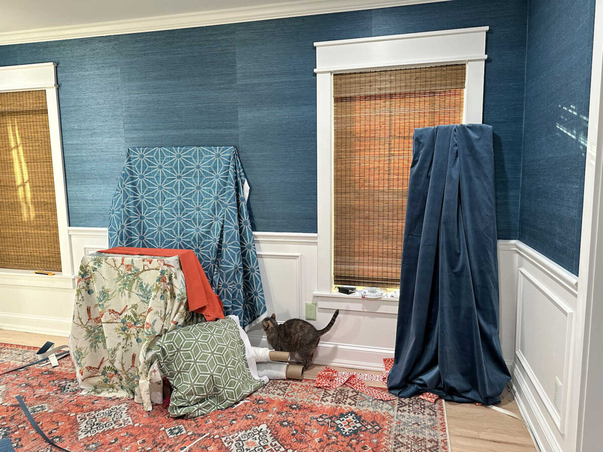
So naturally, I had to bring in the rest of the fabrics to get a sneak peek of everything together. I won’t be using that green fabric on the bed, but that green will be on the bed somehow. What I would really like is to make a striped fabric with all of the colors, including that green, to use on a pillow.
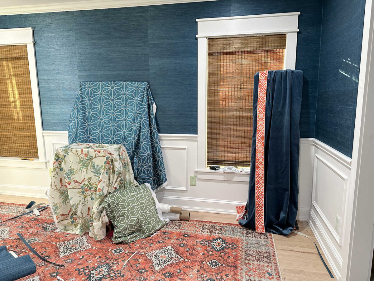
I hesitated to include the drapery trim in a photo because I know a lot of you can’t see my vision for it. Just understand that if I can’t tone it down just a bit, I won’t be using it. It’s way too bright and too white right now, but I’m hoping I can do a tea stain (or coffee stain, as someone suggested) to tone down the color, make it more in line with the corals in the room, and tone down that bright white design. But I was also able to see how the drapery fabric looks with the rest of the fabrics going each direction. This is the dark version of the drapery fabric (i.e., nap of the velvet going up).
And this is the light direction of the drapery fabric (i.e., nap of the velvet going down).

There’s a clear winner in my mind. The dark seems to work much better. But the bed also needs some coral on it, so I brought in the only coral fabric I have. I want to use it as an accent somehow. I love my blues and greens, but I always love them more when paired with warm colors, whether it’s pink or coral. And obviously, I’m not using pink in this room, so adding coral on the bed is a must. Here a peek at that with the light version of the drapery fabric.

And here it is all together with the dark version of the drapery fabric.
So I’m still working out in my mind exactly how I’m going to add coral, and what fabric I’m going to add since I don’t plan to use that green geometric pattern on the bed. My heart really is set on a striped fabric, so I guess I need to start playing around with some design ideas for that so I can have it printed ASAP. In the bedroom mockup I did, I added a striped pillow, so that’s my vision. It’ll need more green, though.
I also need to start testing out some ways to tone down the trim for the draperies. It’s just a touch too bright, too orange, and too white. If I can tone it down just a tiny bit, I think it’ll be perfect.

I’m very anxious to get started on all of these other projects! Let’s hope that things go smoothly today with the rest of the grasscloth wallpaper so that I can finish that up today. I think I want to tackle the draperies next.
More About Our Master Bedroom
see all master
bedroom diy projects
read all master
bedroom blog posts

Addicted 2 Decorating is where I share my DIY and decorating journey as I remodel and decorate the 1948 fixer upper that my husband, Matt, and I bought in 2013. Matt has M.S. and is unable to do physical work, so I do the majority of the work on the house by myself. You can learn more about me here.